the Bundesbank's website was optimised for browsing on mobile devices such as tablets and smartphones. The website now includes responsive design technology and automatically adapts to fit the screen size of various mobile devices. This provides users of these devices with an easier overview of current topics and content.
Accessing the main navigation menu
You can browse the website using the quick access bar, which comprises the customary icons to open the navigation menu, to return to the homepage, to open the search function and to change the language.
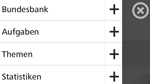
Navigation options
When you open the navigation menu, the navigation options will appear across the screen. This menu contains all the main navigation items. Select the "+" symbol to view all available subitems. To close the navigation menu and return to the previous page, select "X" in the top right corner of the menu.
Switching views
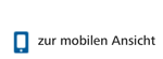
You can switch to the classic version of the website at any time by selecting "to desktop view" at the bottom of each web page.
You can return to the mobile version of the website by selecting the corresponding "to mobile view" icon.
Special features and exceptions
A footer navigation will also be displayed at the bottom of each web page on tablet devices. This navigation feature, however, will not be available on smartphones to avoid unnecessary scrolling.
The time-series database found under "Statistics" will continue to open on mobile devices in the classic desktop view as the information content is too large to be displayed on smaller devices.